Back to Analysis Hub
Onboarding January 1, 2026

Flight Tracker+: first-time user experience analysis

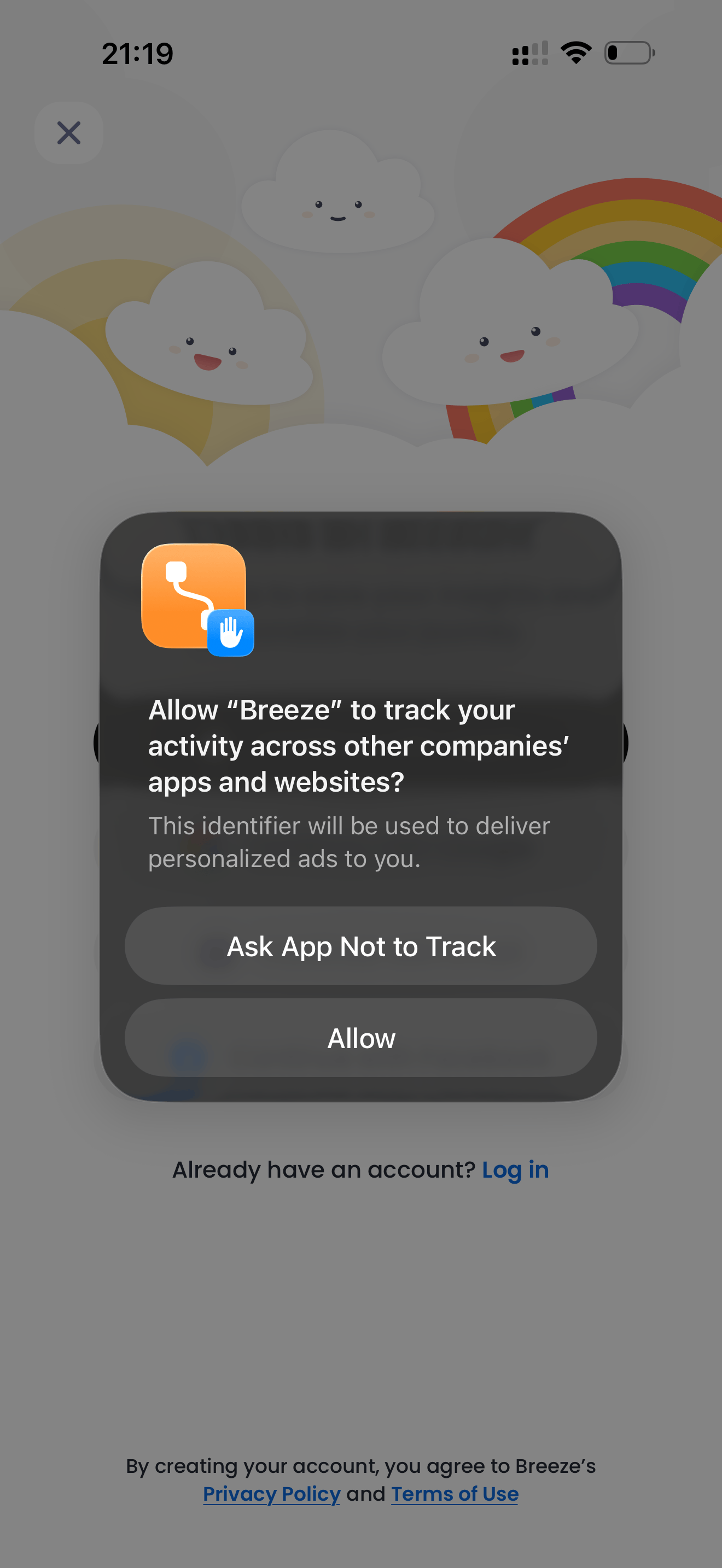
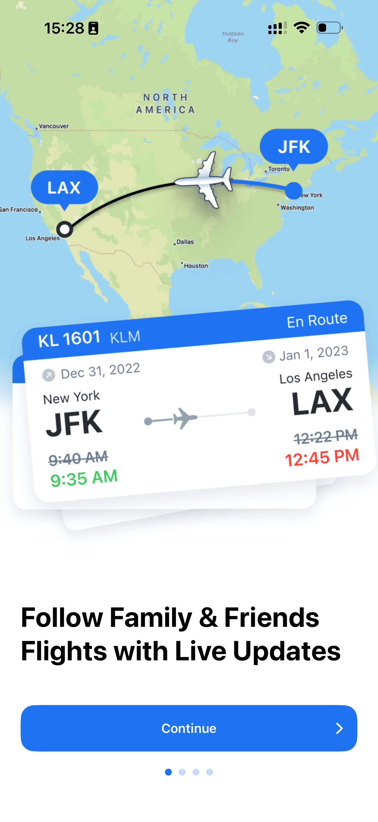
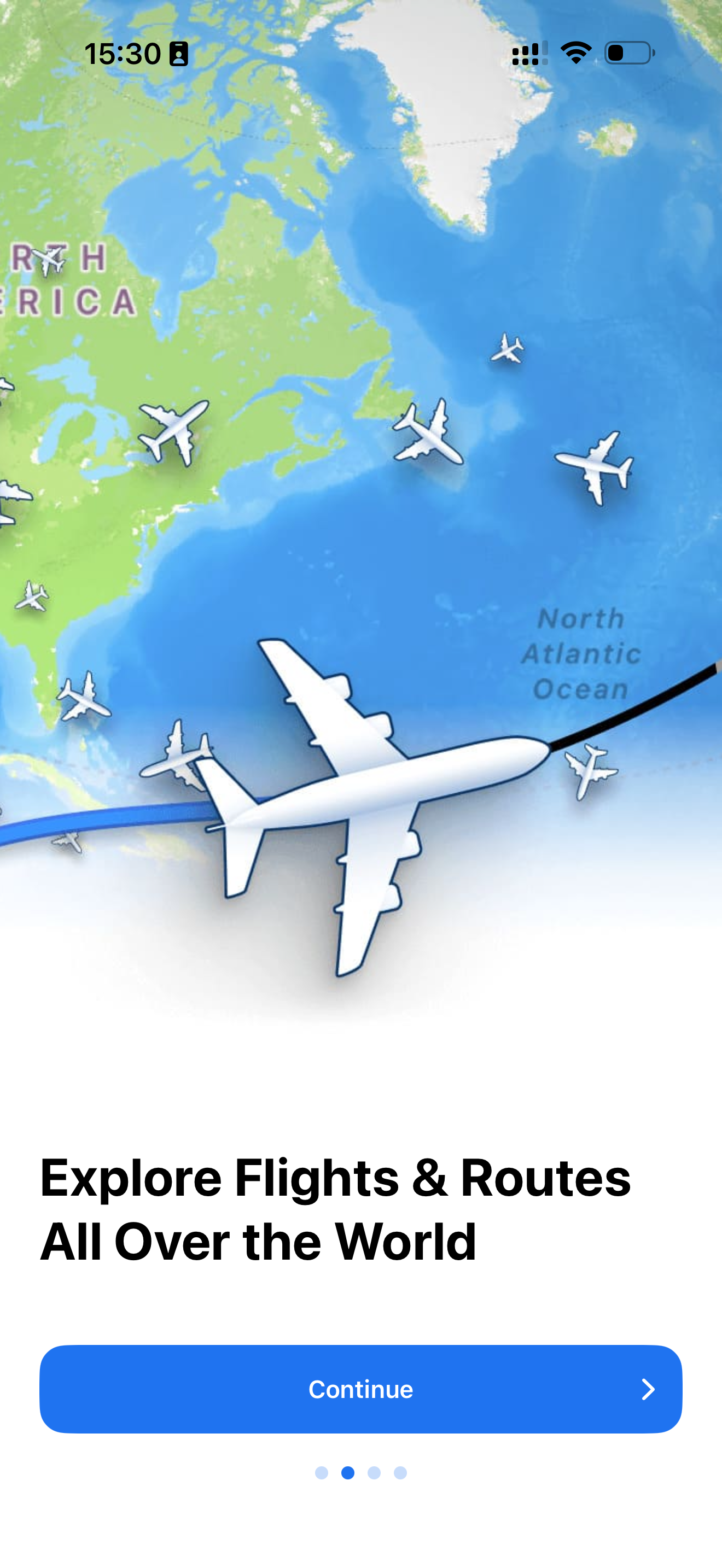
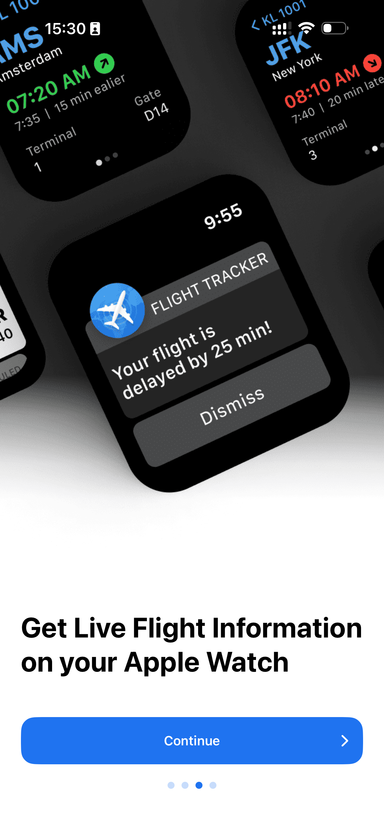
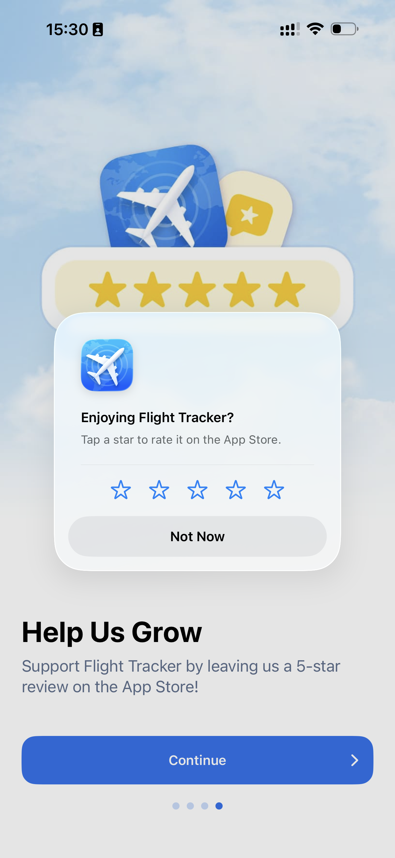
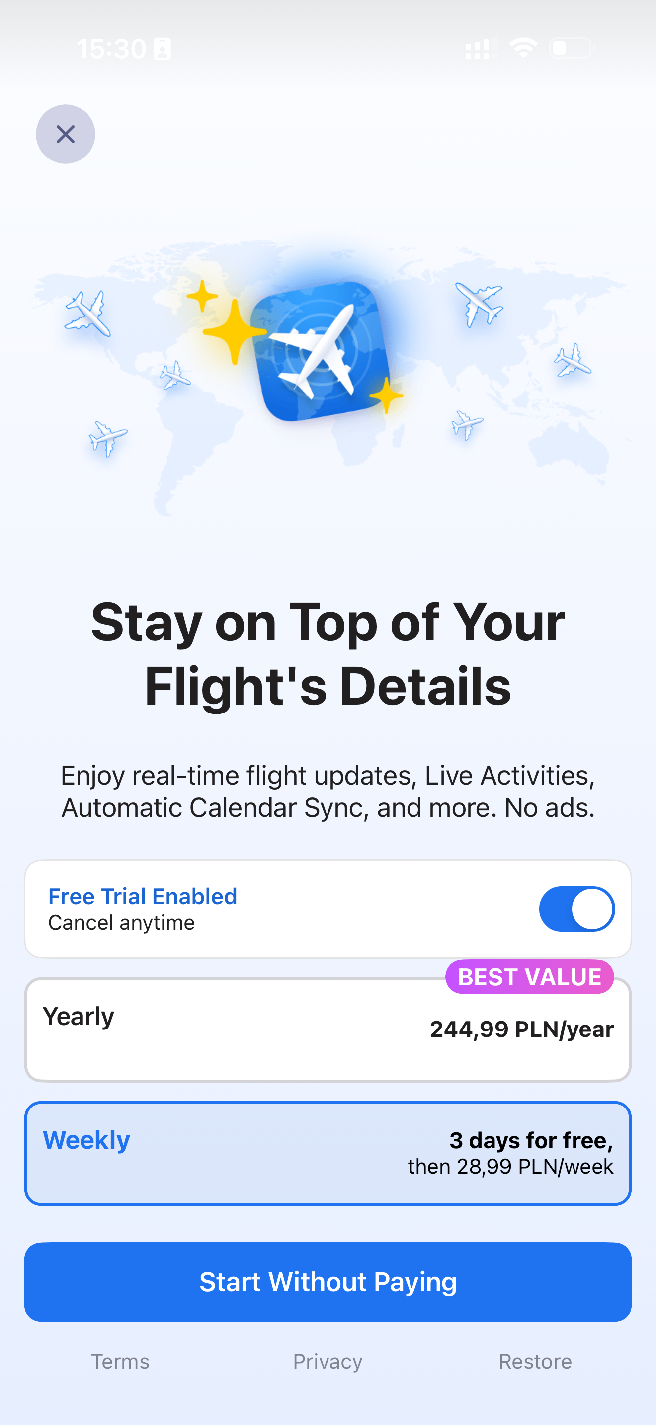
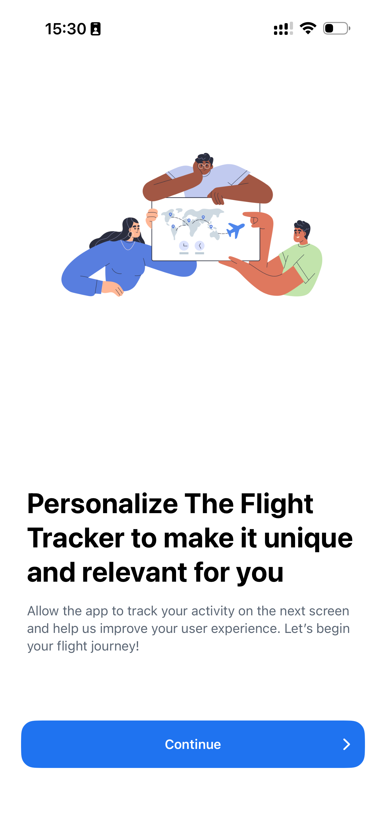
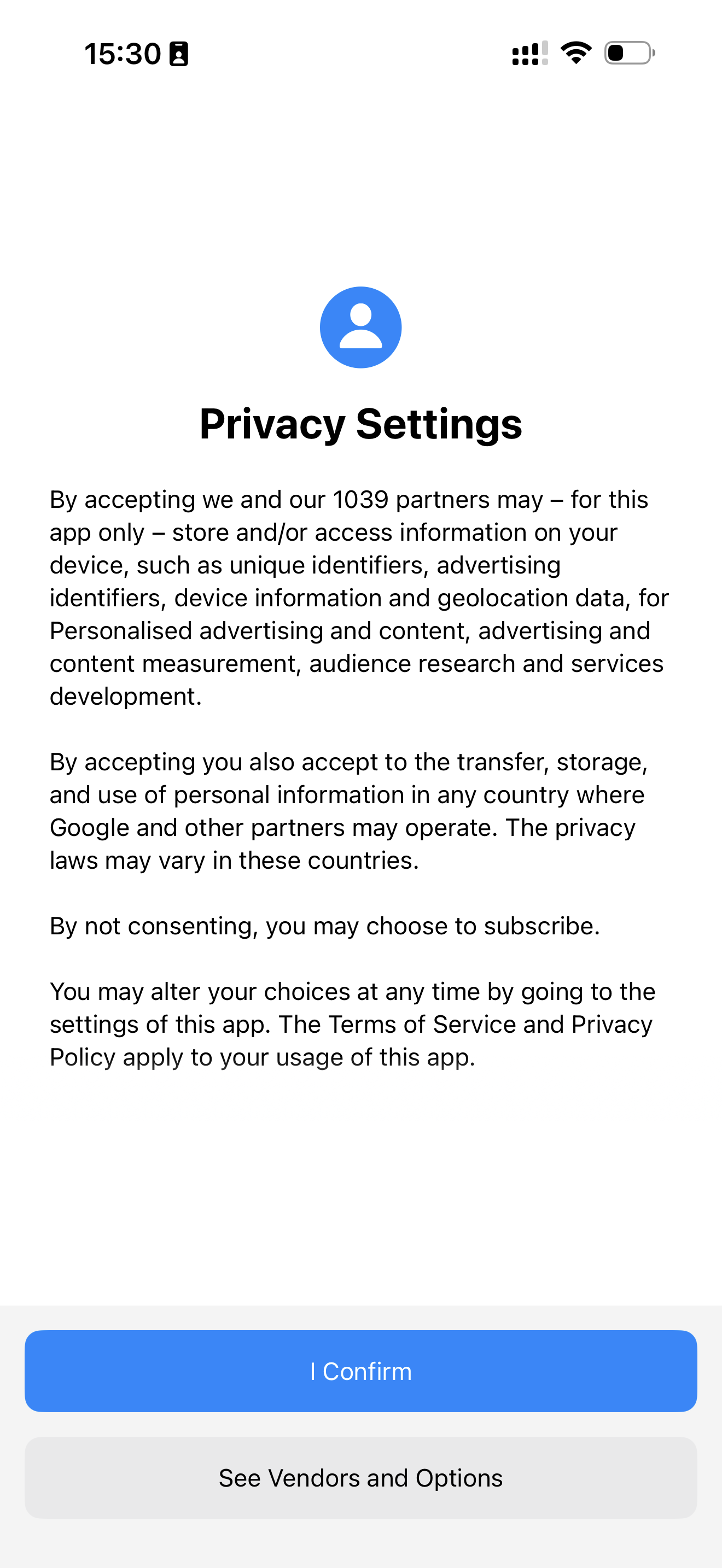
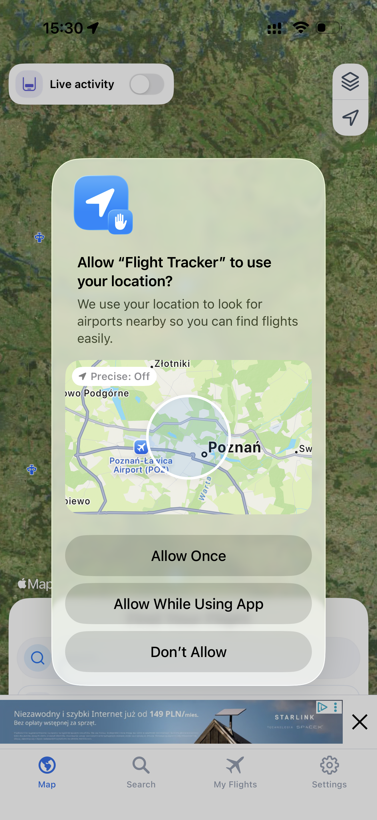
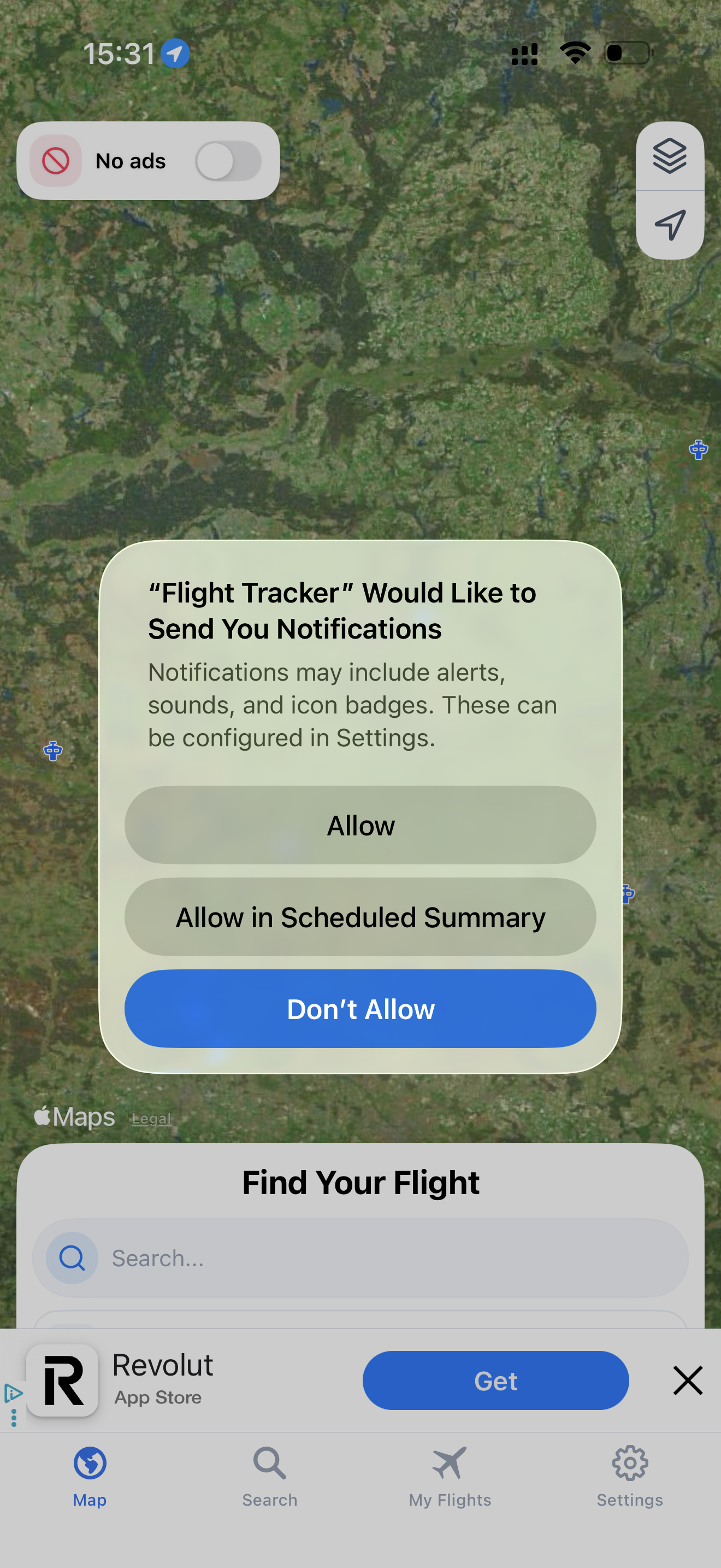
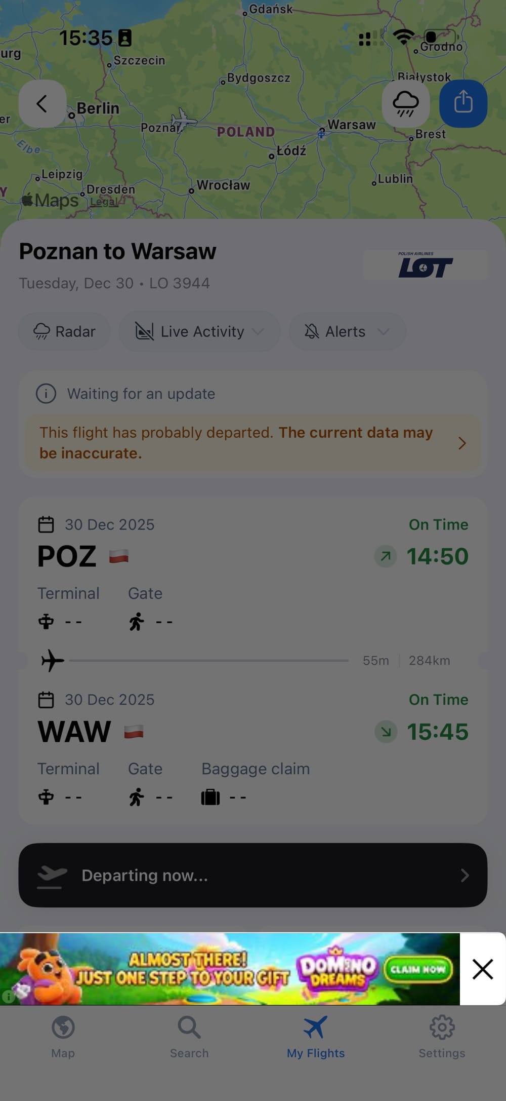
Flight Tracker+ makes a strong first impression with a clean UI and clear utility, especially around flight coverage and Apple Watch integration. However, the onboarding flow pushes conversion and permissions too early—review requests, paywalls, and tracking prompts appear before users fully experience the core value. Despite this, the free tier remains usable with non-intrusive ads, creating a fair value exchange. Overall, it’s a solid product that would benefit from slowing down monetization to build trust first.

Flight Tracker + Icon

Flight Tracker +

Impala Studios

Travel Free 4.7

Global Performance

ae # 6
Top Grossing
Utilities
au # 12
Top Grossing
Utilities
br # 8
Top Grossing
Utilities
ca # 8
Top Grossing
Utilities
ch # 9
Top Grossing
Utilities
de # 27
Top Grossing
Utilities
es # 9
Top Grossing
Utilities
fr # 10
Top Grossing
Utilities
gb # 8
Top Grossing
Utilities
id # 8
Top Grossing
Utilities
in # 5
Top Grossing
Utilities
it # 6
Top Grossing
Utilities
jp # 16
Top Grossing
Utilities
kr # 13
Top Grossing
Utilities
mx # 6
Top Grossing
Utilities
nl # 8
Top Grossing
Utilities
no # 17
Top Grossing
Utilities
pl # 93
Top Grossing
Utilities
pt # 13
Top Grossing
Utilities
se # 32
Top Grossing
Utilities
us # 5
Top Grossing
Utilities
Analysis screenshot 1
1
Initial app open. First impression is solid: modern, clean, and it immediately feels useful.
Analysis screenshot 2
2
Access to all flights. Great—full flight coverage right away is a strong value prop.
Analysis screenshot 3
3
Apple Watch focus. The screen highlights Watch notifications, but the side mockups also suggest a full Apple Watch app. That’s a nice surprise and a strong motivator to continue.
Analysis screenshot 4
4
Review prompt. Asking for a review on the fourth screen feels way too early. I haven’t seen any real value yet—this risks annoying users instead of converting them.
Analysis screenshot 5
5
Paywall. I can start a free trial, which is good. Pricing feels high though—more than a Netflix subscription on a weekly basis. That said, being able to close the paywall via the “X” is a plus.
Analysis screenshot 6
6
Tracking permission. The tracking prompt is handled smartly. As a typical user, I assume agreeing will improve personalization. Still, it leans slightly toward a dark-pattern interpretation.
Analysis screenshot 7
7
Privacy settings. Mandatory in the EU, so no surprises here.
Analysis screenshot 8
8
Location permission. Makes total sense for this app to function properly. Straightforward and expected.
Analysis screenshot 9
9
Notification permission. Asking right after I’ve already agreed to several permissions in a row might be strategic, but I’d prefer more context—what kind of notifications will I get, and why should I enable them?
Analysis screenshot 10
10
Ads for free users. As a non-pro user, I see ads in several views. That’s clearly tied to the earlier tracking permission. The upside: core features are still usable, and the ads aren’t intrusive. It’s a fair trade-off—I get value for free, and the developer earns revenue until I upgrade or churn.
WO

Analysis by Wojciech Olszewski

I work with mobile apps, focusing on marketing, monetization, and product decisions. I'm interested in how things work in practice — not just how they're described in best practices. Through InApp.Center, I share observations and analyses based on real app experience.

© 2025-2026 AppWiso. All rights reserved.